Simplicity and Transparency in the Loan Market
The history of Lendo begins in 2007 when they emerged as pioneers for a new type of loan comparison in Sweden. Their goal was to make the loan market simpler through digitalization and transparency. After Lendo's emergence and success, several other players have popped up in the market. Today, Lendo is Sweden's largest loan comparison service.
Challenges When Working with a Major Brand
How does conversion change when a brand is updated? This is a question you always need to have in the back of your mind when working with a large digital service and their brand. Conversion should always be at the center, and the changes made must potentially increase conversion, even if the brand's experience for those not planning to use the service is also important.
The update of Lendo's brand became an internal request when the technologies behind their web needed to be upgraded. Just as technologies sometimes become outdated, a brand can start to feel stale after a while. Hence, the matter was addressed and considered how the brand could be taken to the next level, just like their web.
For Lendo, it was important that customers and potential customers recognized the brand even if we made changes to modernize the brand. Therefore, we retained the shape of the logo, i.e., it consists of text and a symbol elevated to the right. This ensures the viewer still recognizes the logo at large but may discover some positive differences.
We tested a range of different logo versions before arriving at a decision; a logo that is more personal, fun, and describes what Lendo actually does, i.e., comparison.
User Tests and Data Are a Designer's Best Friend
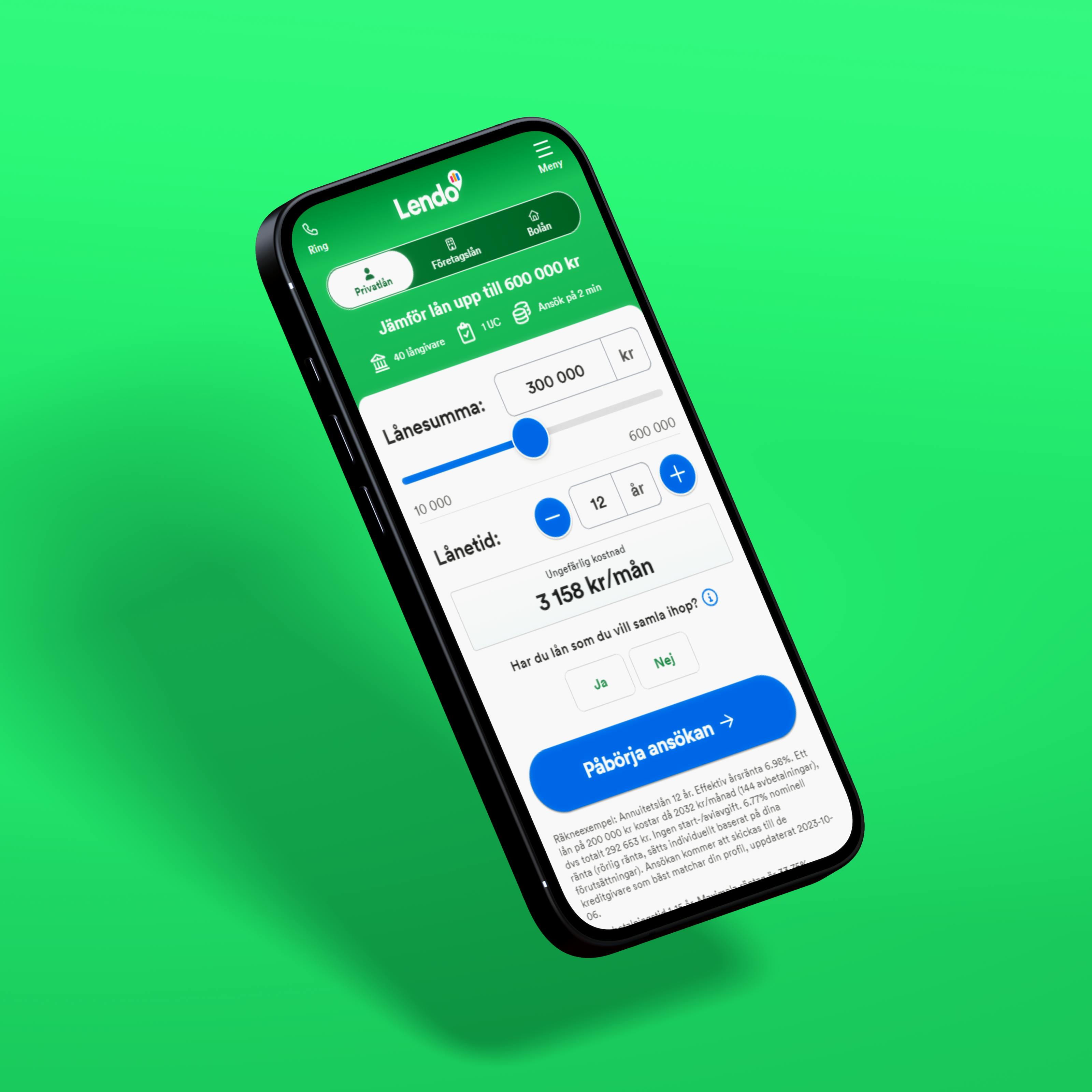
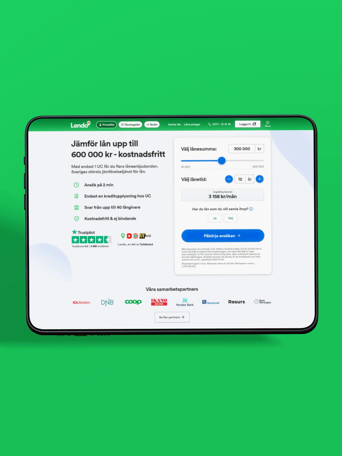
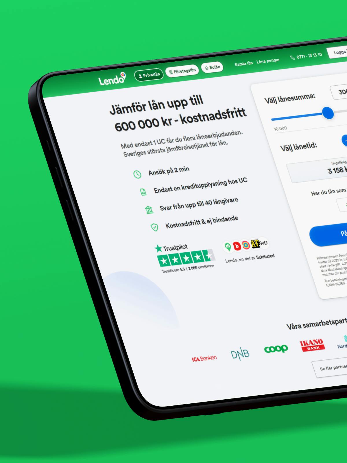
Lendo's web and application flow are perhaps the most important parts of their product. Together with other consultants, a new design for the web was developed. It was heavily based on user tests conducted in the initial phase and the data that could be extracted from the existing solution.
One of the biggest differences from the previous application flow is that the new flow consists of more, but clearer, steps through which the user is guided.
The result: Clearer brand guidelines
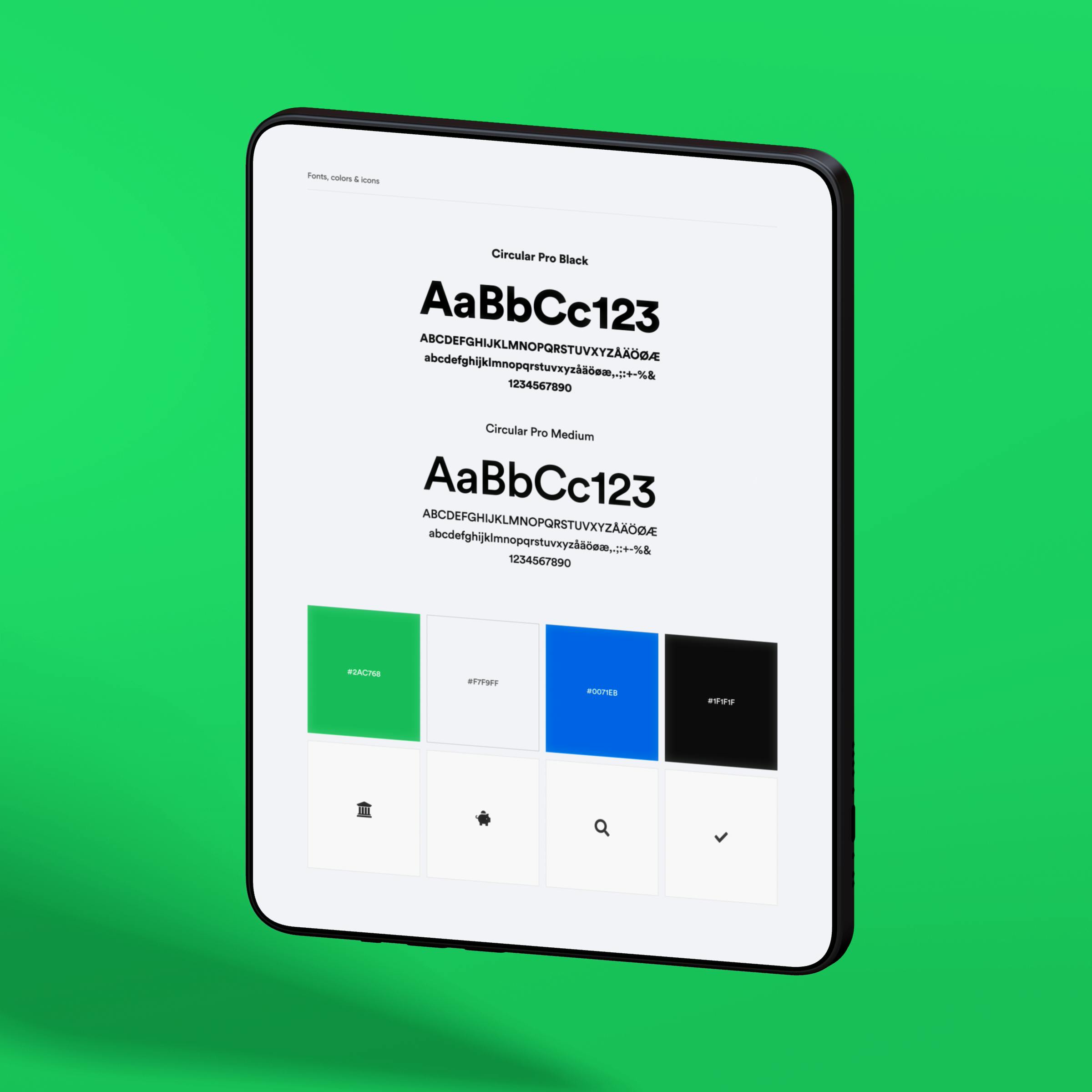
It shouldn't matter whether you see the brand on the web, in the subway, or in a magazine. The viewer should always be able to recognize the brand. To achieve this, a manual is needed for everyone who uses the logo or the associated materials.
After developing a graphic profile for the brand, we think it's important to document how the material should be used. It's not enough to have a design system for those who work with the web. Since designers can't be in the loop for all the marketing materials that are created, it is essential that an easy-to-read manual is in place. Everything from colors and icons to sound loops and animations must be documented so even someone who has never worked with design can send over material to, for example, a printing company in the right way.
For Lendo, we created a stylish digital design guide of about 20 pages and subpages with clear navigation so everyone who works with the brand can find the right information.
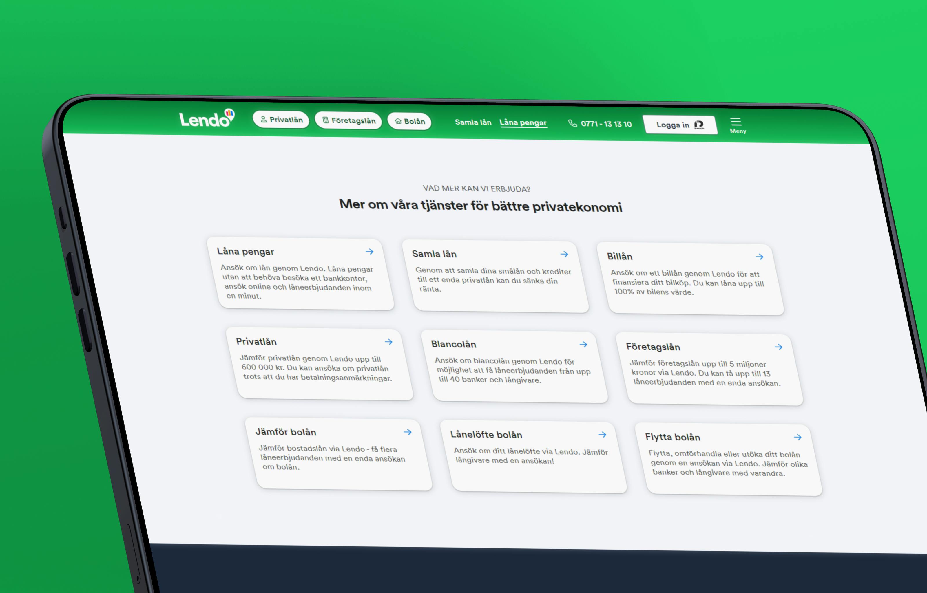
We can also help you create a graphic profile that gives "wow" experiences for your customers. Get in touch with us, and we'll nail down a plan moving forward!